MIX SNACK CO. - Package + Web Design
Self Directed / Team Project / March 2020

A snack food brand that tailors towards healthy, sustainable snacking with a youthful twist.
Branding and illustrations designed in collaboration with Kristi Sprague, Fanni Horvath, and Renate Polle.

Idea
The products are made up of trail mixes, nuts, seeds, and dried fruit medleys that are built to suit the customers’ individual wants and needs. The products are sold online and through our food truck sales. We use only ethically sourced foods with an emphasis on sustainable packaging and sales methods. The company is very focused on our economic footprint and reducing it as much as possible while still providing the world, specifically our youth, with a healthier, more environmentally friendly option.
.

Goals
01. Contribute to an overall sense of cohesiveness throughout the entire brand, staying on point with bold, fun, and modern design traits.
02. Convey a sense of fun, playfulness, and youthfulness that shines through each package design whether that is for jars or boxes.
03. Follow all Consumer Packaging and Labelling Act regulations according to the Government of Canada so products are fit to be sold in Canada.

Challenges
Snack food packaging is often wasteful and not something the consumer will keep. The challenge was finding a way to make the packaging memorable and playful while keeping it sustainable to reduce the company’s overall carbon footprint, contributing to good corporate social responsibility.
Trusting the Process


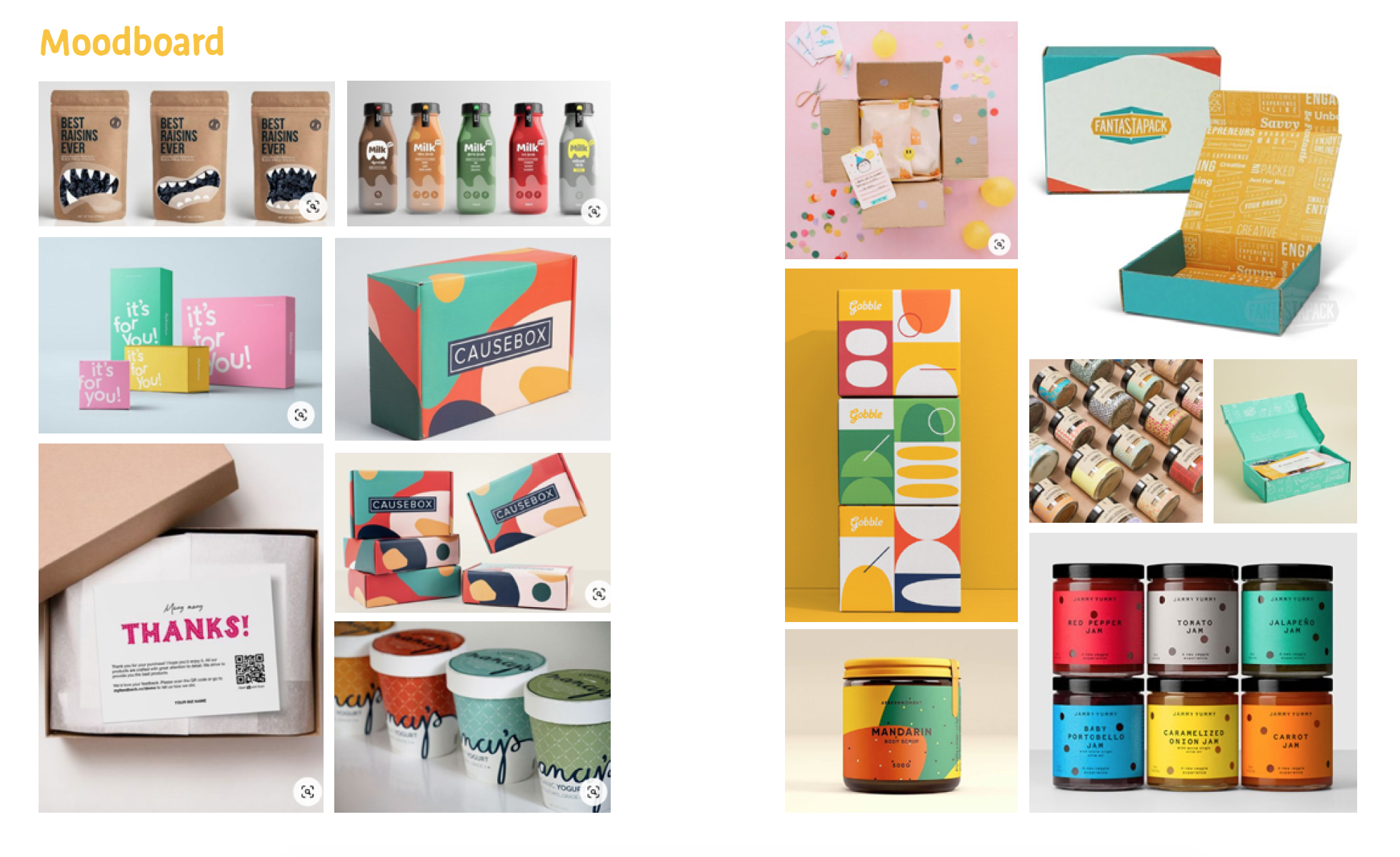


Research + Findings
> The base packaging for the products would be created out of an “Omnigradable” material that is created by TekPak solutions out of Hamilton, ON. The company designs a variety of food-grade plastics that are completely compostable in under 20 months in any type of conditions (TekPak, 2020, p. 3)
> The labels are also to be printed using soy-based inks as they have many benefits such as rich and vivid colours, environmentally sustainable, and they are also cost-effective compared to other inks.
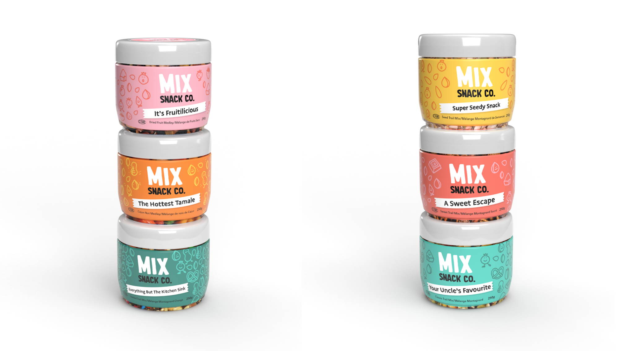
> An aspect of the packaging which sets them apart from the competition is the magnetic lids built into the packaging. Since TekPak allows for customized packaging systems, the lids have built-in magnets which allows for easy stacking and storing in cupboards but also gives the customer something to keep and remind them of the company once the package is empty
> Every package follows the strict package design guidelines set out by the Government of Canada, where writing is in both French and English, text size is considered, nutrition facts, ingredients, weight, expiry dates, place of manufacturing, and more are on every package (Canada, 1999, p. 1).
> AODA standards were also considered when thinking of text size, colour contrast, and interpretation of the product.
Research was done to review the competitive landscape of the snack food industry to understand others’ successes and failures.
Ideas for solutions and sourcing of sustainable and local materials were also researched.
All of this informed design decisions for the product packaging, branding, eCommerce website, and more.
Solution + eCommerce Video
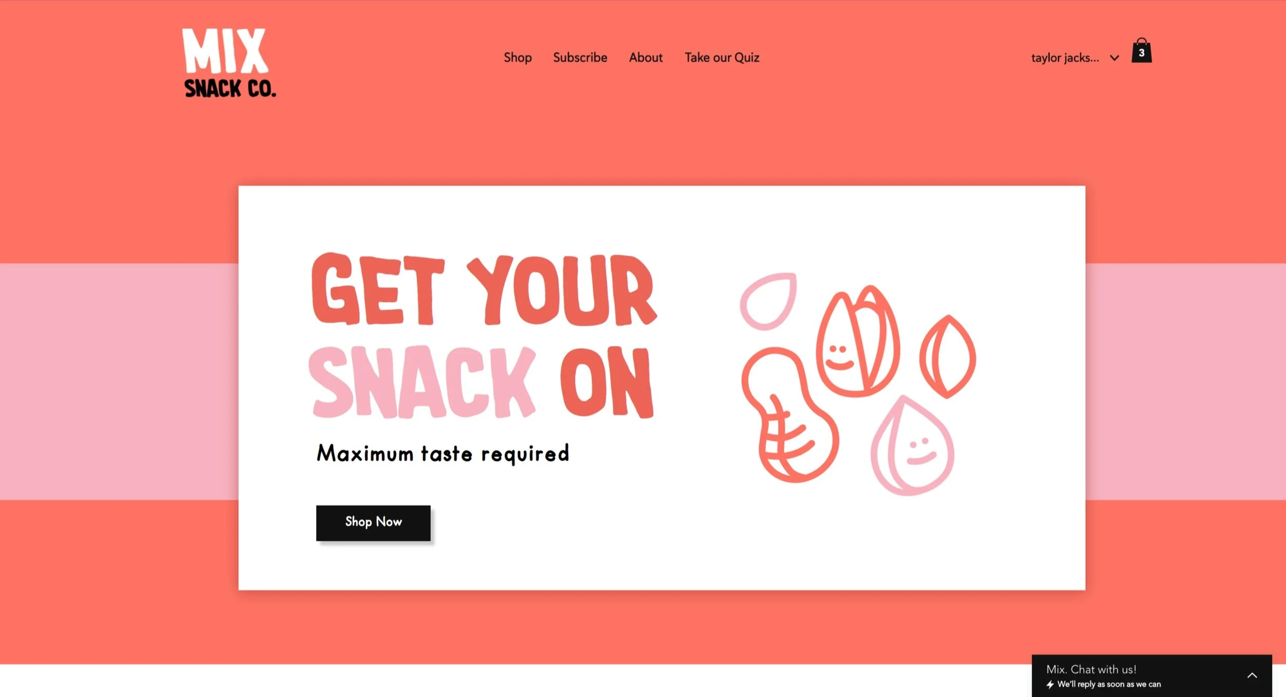
For a snack food brand, packaging is a vital component of the design system. Package design helps contribute to an overall feeling of cohesiveness throughout the brand. For a snack food company, the packaging is one of the things a consumer will remember most. The packaging was designed to suit the overall brand tone and message: bold, fun and vibrant. The packaging uses illustrations to convey a message to the audience without even having to read the label, while also using colour to let the audience know what might be inside.